
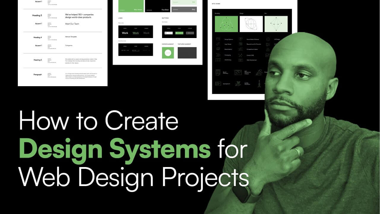
In today’s video, I’m talking about design systems and how you can leverage them in your website design and development process to really crush it and provide a quality product for your client. Let’s go ahead and do it.
Let’s break down what design systems are and how they function in regards to your website. So what I’ve done is I’ve pulled up Dribble, and I’m just showing you design systems in real time so you can get a visual aspect of what these things do.
And these are examples here like Ninox, and Alloy—these are examples of pretty detailed and robust design systems. And so, what these do is present a collection of all the UI resources that a design company may have.
So that can include code snippets, development resources, code, documentation, page screenshots, image examples, branding guidelines, tools. Everything that’s a cohesive part of how that brand functions in the digital landscape.
And so it really just helps the entire team to have an essential workflow to work from when they’re creating designs and digital assets for clients. So think of it as, like, your brand bible, but even more in your whole brain. So it can include code and other components that are outside the design system.
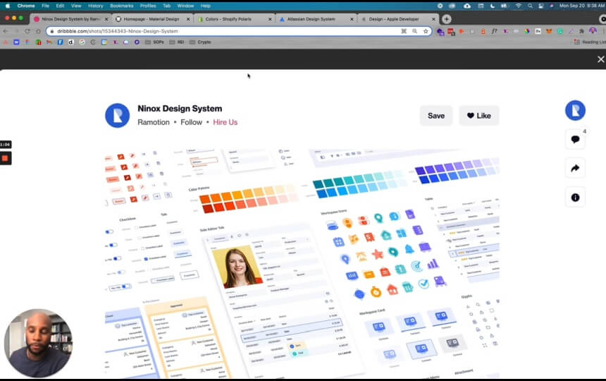
So let’s click one for example, this one looks really cool. And then what I’m gonna do is I’ll show you our example, and a few big agency and big client examples. Just to give you an idea.
And the main reason you want to do this is to, one: have a central location for all these assets that the client or your team can access. And then what this also does is if you offer web design services, it’s a great value add-on for the things that you already provide.
So in this example, you can see that they have different icons, color palettes, and some custom icons here. And again, it doesn’t have to be this robust. Depending on the project, you can do a simplified version which—I’ll show you—we just did for RV brand.
But ultimately, it’s every component as a part of your workflow in your business.
So this is an example from Dribble, let’s look at another really cool one here as well.
This one is by Felipe Pires, this one looks really great. But you can see that he even has buttons and triggers, he’s using, like, a Google font here. There are different color palettes that are included, icons, right?
So now any part of the team can now access this file and be able to make digital assets, like web pages, Facebook ads, or whatever they’re working on.
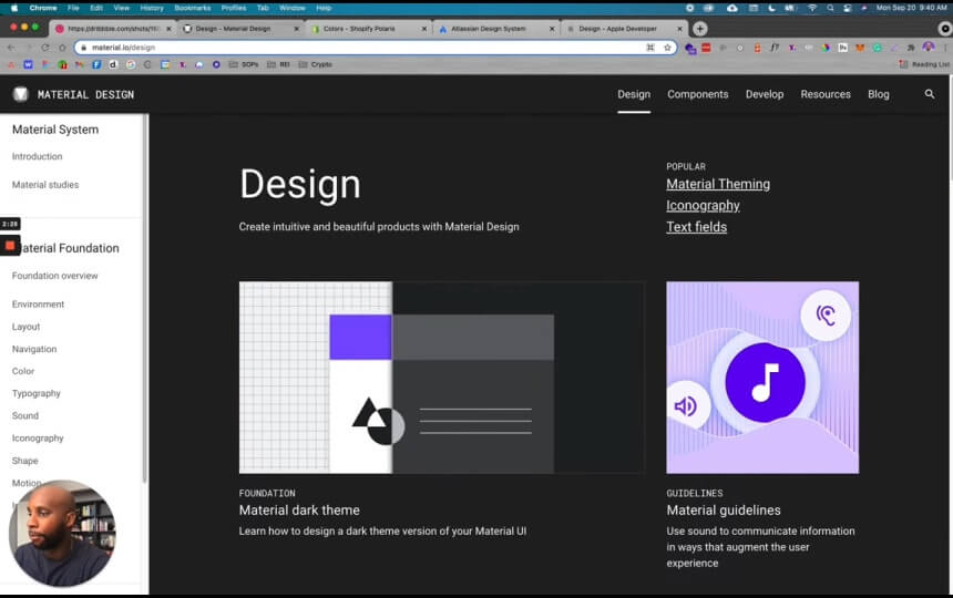
So here’s another example from Material Design. This is a really great website that has just design guidance and code, and it can show you different components based on what you need to jumpstart your projects.
So if I look at Material Design guidelines and I click this, it’s gonna show me the breakdown in a cohesive kind of version. And so this is from the goats at Google themselves. This is what they use to really develop their entire design system.
So if they’re using material articles, this are some of their system icons that are consistent with the brand, typesetting. So you can click these to learn more in regards to the type scale, how these should generate, and how these should be applied to an overall brand.
Now this is a pretty robust design system! But this allows other brands and individuals to have a strong foundation to build on while you’re building out your brand.
Another example is Shopify. As we know, it’s probably the biggest ecommerce platform out there, period. This is a look at their color system, their typography, different illustrations that they have.
And some of the bigger brands actually build a full website or dashboard with all these components to help their team members be able to make all these assets that are needed. So as you can see, we have colors here, we can push illustrations and it’ll have the specific illustration files.
And a lot of times with design systems, you have specific principles, and you have to stay within the confines of those principles. So with illustrations, always be useful, keep it in the family, so you wanna make sure that there’s consistency between the illustrations as well as styles.
And here’s the color palette that Shopify is looking for, here’s the overall shape, sizes, space. So it’s really good to familiarize yourself with these links. I’ll link these in the description as well, so you can check these out in your own time.
But ultimately, this is a great way to really understand how you should visualize and create your designs.
So this is another one, Atlassian is a great one for looking at components and patterns, as well as pulling information like Mission, Personality, and Promise. So you can scroll through these, they have an entire library, they even have a Figma library as a part of their team.
But a lot of these platforms are, like, internal, for teams to be able to access these files and documents in one central location. So you can see that they have design principles, they even have their own Figma library—which is probably internal. A lot of these are locked because these are more so for internal team members, but this gives you a visual idea of what to look for when you’re creating your design systems.
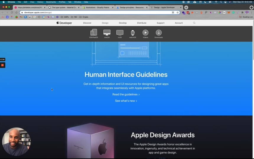
And, of course, the goats of minimalism and clean, efficient design: Apple. This is Apple’s human interface guidelines. This is in-depth info and UI resources for designing great apps that integrate with Apple.
So if you wanna create an app that has Apple design principles—very centralized, clean, efficient—you can follow these breakdowns to really learn more about what they provide. So you can click here to read the guidelines, and we’re gonna choose MacOs because we use that so often.
And so, what you can do is you can look at App Architecture, Full Screen Mode, and it’ll show you what that looks like. It’ll provide tips on specific things as a part of that support system, so you can make sure you’re staying in line with those principles.
You can also look at User Interaction, how users enter data based on Apple’s principles. So if you’re designing an app or doing a UI/UX for an app, you can leverage a lot of these tools to help you get that job done efficiently.
So with that said, this gives you an understanding of design systems. Now let me show you a real-time example of what that looks like.
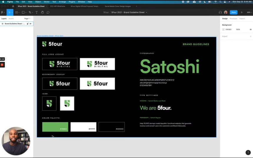
So right now, I’m in Figma. This is our main platform for how we collaborate and work as a team. We’re actually doing a redesign of our main agency site: 5four Digital. So this is kind of a really centralized and very simple version of our brand guidelines.
So this includes a full logo lockup, a secondary lockup which can be a secondary version, the different icons on backgrounds, color palettes, and then our typography—which is Satoshi.
Now to make this more elaborate, what we’ve done is we created a design system based on these principles. And you can see that here in our high fidelity wireframes, here’s all the main pages here, but then here’s the design system that we used to cultivate the look and feel.
So you can see, we have the same color palette, the same typography. What we like to do is break down the typography by different heading types as well as paragraphs. And then we also provide the different sizes: this is Regular, 20pt font, zero pixel letter spacing between each one—we haven’t maximized that and done anything with kerning in regards to that design.
I can go here and I can look at the color palettes that we used, what happens if you hover over a link or if that link is disabled, as well as hover elements on the site. So now our team, going into this, can say, “Okay, I know what color palette to use, I’m building a new page, I know what assets to use to get the job done.”
And then the last part is all of our icons. So we have branding design and dev, and these are custom built icons for all the services that we offer. So this carries over into all these different components, like if we’re doing our proposals.
You can see our proposals here, now it has the same color palette, the same look and feel, we’re using the same icons as we used in the design system. So everything stems back from that design system that we’ve created. Also, if I go back here, I have social media assets here that all follow that same continuity based on this design system.
So this is probably the easiest and simplest way to get these done, like you can literally just have three pages where you have your main typography, your color palette here, links, buttons, and then site icons. And this can be as elaborate as you need it to be.
So we actually got a UI kit from an amazing designer. His name is Jordan. He provided a UI kit, called “Untitled UI.” And this is a HUGE design system.
I’ll tag his info below as well, so you can check that out. He has a free version, and he has a paid version—which is like $99—but trust me, it’s absolutely worth it.
So just to give you an example, he has colors, typography, icons—so many robust resources in this design system. And you can see components, badges—you know, I don’t wanna give you the full rundown. But this is just an example of a very robust and detailed design system.
But again, I just want you all to know that you don’t have to go that elaborate—especially if it’s like a smaller brand or a smaller startup. You can always scale up your design systems. But it’s always good to have a starting point and something basic that you can use to really get the job done.
So, again: Typography, color palette, links, buttons, your essential site icons—and you can get these site icons from a company that you purchase like Flaticon or Shutterstock. But ultimately, you wanna bring those into your design system so you can start to build outward.
So last thing I wanna show you is what an example looks like once you create this design system.
So now that that’s created, now we have our website design here that we’ve been working on for the last few weeks. So this is our agency site, as you can see there’s a big grey box here for a video that we’re going to add. But now you look at this and you see that the typography, the design, the icons, the color palette all match the design system.
So now, what’s great about this is, you have a designer or you can have a team of designers all working on a particular project, working on different components, but you still have that consistent look across the board. And that’s the main thing I wanted to get across in this video.
Again, this was a great, great opportunity to be able to show you how this is done. If you have any comments below, let me know.